This post and photos may contain Amazon or other affiliate links. If you purchase something through any link, I may receive a small commission at no extra charge to you. Any supplies used may be given to me free of charge, however, all projects and opinions are my own.

Have you ever been unhappy with your sublimation project? Today I’m going to teach you 10 different ways you can prevent dull sublimation.
There are a variety of reasons your sublimation project may not turn out how you imagined. With the help of these tips, your sublimation projects will be vibrant and something you’re proud of in no time!
Are you still deciding what sublimation printer is right for your craft room? Check out my breakdown of sublimation printers to help you decide today.
Why is My Sublimation Dull?
There are a wide variety of reasons your sublimation may be dull. Everything from printer settings to heat press settings and moisture to photo quality plays a part in getting a vibrant sublimation print.
I’m going to walk you through the 10 most common reasons for dull sublimation and how you can prevent it in the future. You can actually watch me go through all 10 steps by clicking play on the video below.
Supplies Used
The supplies listed above are supplies I use for every sublimation project. You’ll always want protective paper to protect your surface and heat source.
IMPORTANT: A sublimation print is sublimation ink printed onto sublimation paper from a sublimation printer. You cannot get a sublimation print from a regular printer.
10 Ways to Prevent Dull Sublimation Projects
One more thing before we begin. Patience is a requirement when troubleshooting sublimation issues. Sometimes it can take working through a few of these different tips to figure out what the problem is. Give yourself time to work through them.
Let’s jump into 10 things you can do to prevent your sublimation print from being dull.
#1 Image Quality
The first thing to be aware of is image quality. The most important thing is the image resolution. You want your image to be at least 300 dpi.
Most images taken on current cell phones are fine for sublimation. You do need to be aware that sometimes, images that are backed up to the cloud can be saved at a lower resolution. I always recommend checking the resolution size before printing to make sure it hasn’t been resized. Images that have a lower resolution do not sublimate well.
Another thing to be aware of is that photos from older phones or older digital cameras may also have a lower dpi. This can also happen with older photos that have been scanned. The lower resolution can mean that the colors might not be as accurate or vibrant as you would get with newer cameras or phones.
Currently, there is nothing really that can be done to improve the resolution of old photos. I have seen some cool things that are in the works that will hopefully be available in the next few years that can help with low resolution.
Remember to check the image resolution before printing because image quality can cause dull sublimation projects.
Images from Websites
Another thing to be aware of is images from websites. First of all, if you Google something and pull the image to use on a mug or a tumbler it is copyright protected. Also, images used on websites aren’t usually uploaded for print quality. Typically images used on websites are uploaded at a lower resolution to reduce site loading times.
If you want to use one of those images, make sure you find the original source, get copyright permission, and ensure the image has a high enough resolution that it will print appropriately.
#2 Image Contrast
Another image issue that can cause dull sublimation is when an image doesn’t have contrast. Photos you take with your phone can be great for sublimation projects. However, sometimes photos can be too dark or too washed out. Without contrast in a photo, the colors don’t really pop.
Often times you can edit a photo to increase the contrast. There are a lot of photo editing software you can use for free but you may not even need that. On my phone, I can edit the brightness, contrast, shadows, and more right in the phone.
Before you print out the image, look at the photo. If the colors don’t pop on the screen, they won’t pop on your project.
#3 Dull Prints from Your Printer
This is something I see people worried about often. Sublimation ink does not print vibrantly on sublimation paper. Your sublimation print is going to look dull and it’s possible that the colors will look drastically different than what your image looks like.
This is totally normal. The ink won’t be vibrant until after heat is applied. The only way to actually see what your print is going to look like is by pressing it, which leads us to our next tip.
#4 Apply to 100% Polyester White Fabric
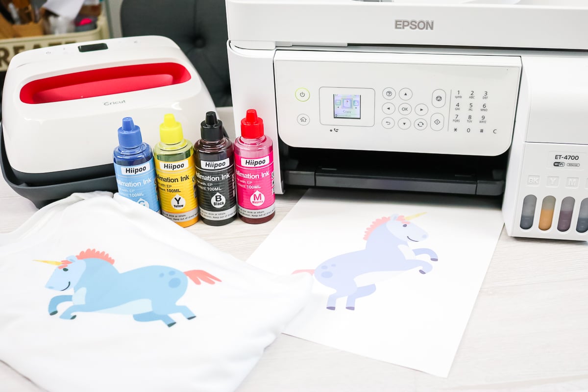
I recommend testing your print on 100% white polyester scrap fabric before applying it to a blank.
Sublimation blanks can be expensive. Wasting them is not fun. By applying the design to white 100% polyester fabric first, you can see how the print looks. You’ll be able to see if the colors are vibrant and pop how you want them to best on white polyester fabric.
You can purchase 100% white polyester fabric in a variety of different ways. Get a set of inexpensive sheets, buy a few yards from the fabric store using a coupon, purchase inexpensive white polyester curtains, etc.
A sublimation print itself is really inexpensive compared to wasting a blank.
#5 Avoid Moisture
If there is one true enemy of sublimation, it’s moisture. Moisture and humidity can make your project look like a total failure. It can cause dots or even entire faded areas in your project. If you are seeing these kinds of issues, you are probably dealing with a moisture or humidity issue.
Controlling the humidity in your space can go a long toward eliminating these problems.
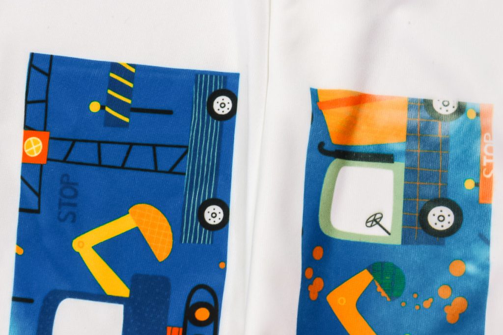
Another way to prevent moisture issues is to pre-press your sublimation blank. Fabric blanks can definitely be pre-pressed. Other flat blanks can be placed in your heat press and can be pressed for a few seconds to remove any moisture.
Some items you may not want to actually pre-press but still want to remove moisture. For things like hardboard coasters, I place them in my heat press and then hover the heat source over them for a few minutes without closing the heat press. This helps the moisture evaporate out of the blank.
To really test what moisture can do to a sublimation project, get your polyester fabric wet and apply a sublimation print to it. This will show you what a project looks like that has moisture issues so you’ll be able to spot it in the future when it happens.
#6 Printer Settings
Printer settings can also play a role in if your sublimation print is dull or vibrant. Let’s look at a few different popular sublimation printers.
Converted Epson EcoTank
If you have a converted Epson EcoTank, I recommend using the following settings:
- Matte paper setting
- High quality
- High speed off
- Mirror on
From there you can do any color correction you’d like, either manually or using an ICC profile.
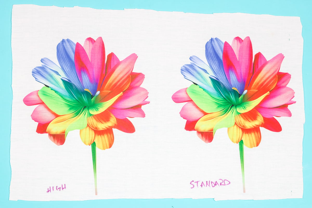
Here are two images I printed with my EcoTank printer.
All of the settings are exactly the same including the pressing time and temperature. The only thing I changed is that one is printed with High Quality and the other is Standard quality.
You can see that they’re very similar. I actually prefer the standard quality one better. The difference between the two is that the high-quality print will lay down more ink on the paper.
With the standard quality, you’re getting less ink down on the paper. Depending on the surface you’re pressing on you may find that one works better than the other. You can also change the paper type if needed.
Glossy versus Matte versus Plain paper settings will all lay down different amounts of ink. If your project isn’t turning out like you wanted, try changing the paper setting and that may help.
Sawgrass Sublimation Printer
If you have a Sawgrass printer, it does adjust a lot of the settings for you depending on the surface you select that you’re putting the print on.
If you’re having dull sublimation issues, you can look at a couple of different options in color management. You have two options photographic or vivid.
If you’re printing something that is a photograph that includes things like skin tones, I would choose the photographic setting. This can also be a good setting for landscape prints.
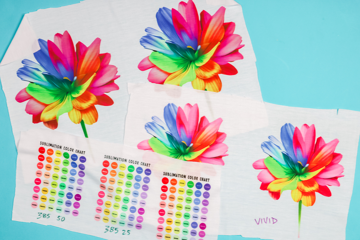
For other designs choose that vivid setting. These two prints are pressed to 100% polyester fabric, both using the same time temperature and pressure.
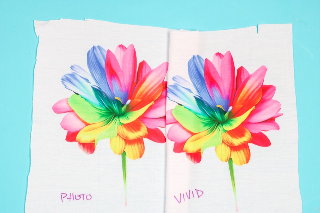
It’s a little hard to tell but the vivid setting really does pop off of the fabric a lot more. You can see, in the blue-white area especially, that the contrast really helps the colors pop in the vivid setting.
Epson F170 Sublimation Printer
For the Epson F170, there aren’t a lot of different settings you can change. You can choose if you’re pressing to a textile or rigid surface, that’s pretty much it.
Those settings do typically work well. If your sublimation prints are dull, try out some of the other tips in this post with the F170.
#7 Time, Temperature, and Pressure
The time, temperature, and pressure you press your sublimation print can have a huge impact on your finished project. I always recommend starting with the settings for your specific blank. You can typically find these wherever you purchased the blank.
You can do some experimentation if your sublimation print is looking dull. On 100% polyester fabric, I like to press at 385 degrees for 50 seconds. These are the settings I like to really make those sublimation colors pop.
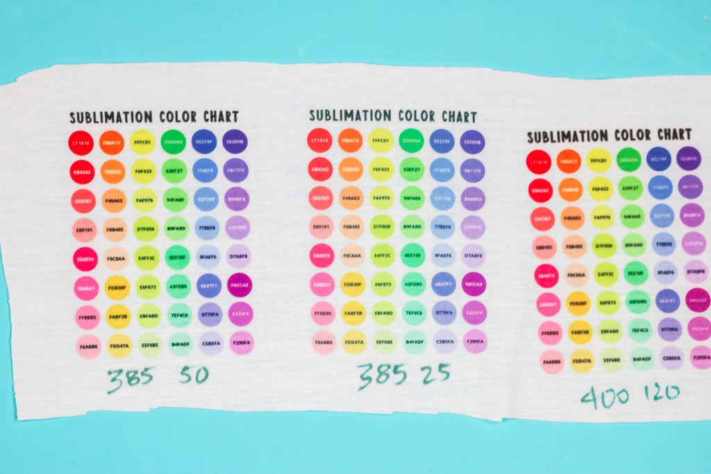
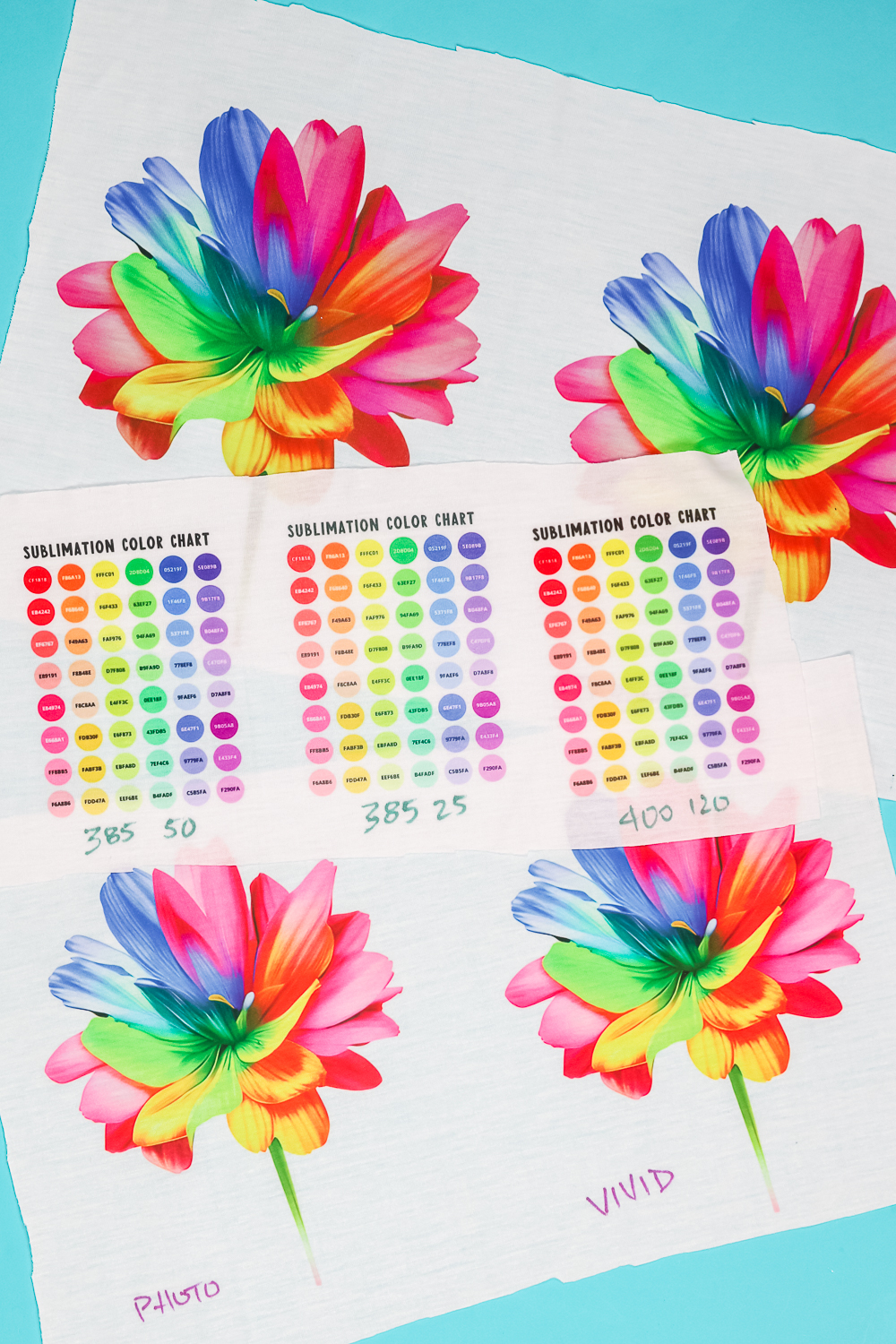
I wanted to show you what happens if your time or temperature isn’t right. I used the same pressure for all 3 projects above but changed the time and temperature.
The first project is 385 degrees for 50 seconds. The colors all look great.
For the middle project, I pressed at 385 degrees for 25 seconds. It’s a little hard to tell in the photo but the colors are dull and don’t pop off the fabric at all. If you look at the pinks and reds, you can really see how much more muted they are.
So, what happens if we overheat our sublimation? For the last project, I pressed at 400 degrees for 120 seconds. This is definitely too hot and too long. The images are blurry, not sharp, and dull. They don’t pop off the fabric at all.
The time, temperature, and even the pressure can have an effect on your sublimation print. If your sublimation print looks dull, one of those may settings may be the reason.
#8 Color Correction
When talking about printer settings I mentioned color correction. With a converted Epson EcoTank, you need to think about color correction. Manual color correction and ICC profiles can have a huge impact on your colors in general.
These settings can help your pinks not look orange and your blues not look green. They can also really help with dull sublimation prints.
You can learn all about ICC profiles and how to use them in my Ultimate Guide to ICC Profiles. That post has all the info you need on how to use ICC profiles for color correction.
#9 Use 100% Polyester
Another thing that can cause dull sublimation is not pressing on 100% polyester fabric. Sublimation bonds to polyester. If only 50% of the fabric is polyester, the sublimation only has half the fibers to bond to.
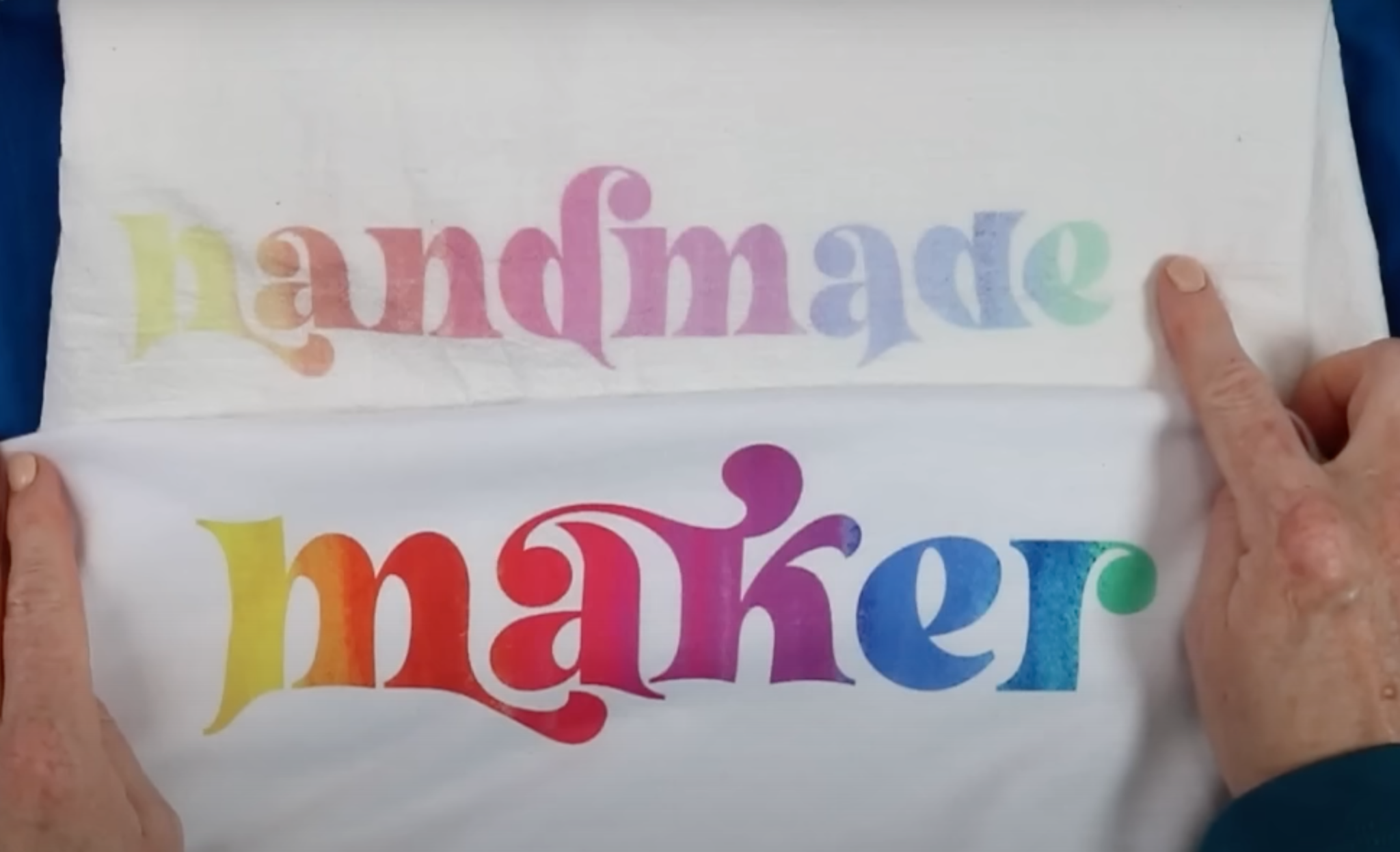
You can see in the photo above that the bottom print is much more vibrant. The top fabric is 50% polyester and 50% cotton. You will not get a vibrant print with a 50/50 fabric. If you want vibrant prints, try 100% polyester fabric if possible as it will give you the best results.
#10 Use White or Light Polyester Fabric
Another thing to think about when choosing blanks is the color of your blank. Sublimation ink is translucent which means if your fabric has a color it will show through the sublimation ink.
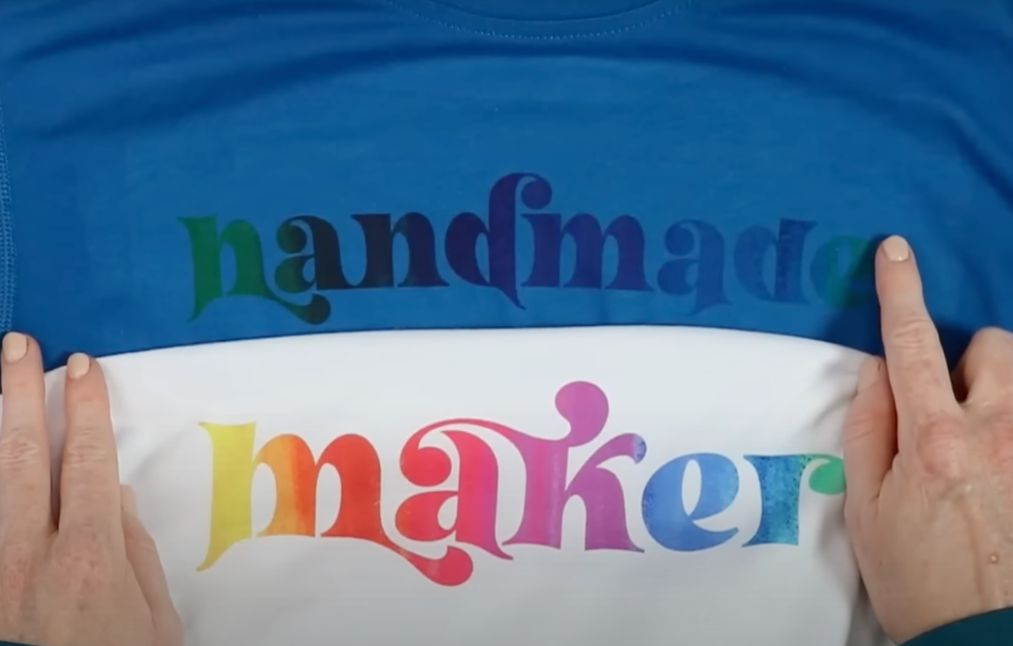
Both of the shirts above are 100% polyester. You can see that the blue fabric shows through the sublimation ink. The yellow ink looks green and other colors like red, pink, and purple are all darker than they are on the white shirt.
To get colors that are closest to what you see on the screen, choose a white sublimation blank. You can use other light colors but anything that has a color will distort your sublimation print and the colors won’t pop the way you want.
The same is true with surfaces that are clear or frosted. Because you can see through clear and frosted surfaces your sublimation will be more dull than if the blank was white.
You’ll see the difference when you hold clear, frosted, and white blanks that have been sublimated next to each other. The white will be significantly more vibrant than the clear or frosted surfaces.
BONUS: Brand of Sublimation Ink
I’ve already shared 10 tips to help with dull sublimation but I wanted to share one more. The brand of sublimation ink you use can impact your sublimation print.
With my Sawgrass printer, I only use Sawgrass original ink, I’ve never had any issues with that combination. When I use my Epson F170 I only use Epson original inks, again they’ve always worked great.
With the converted Epson EcoTank printer, there isn’t an Epson brand of sublimation ink that works with it. I personally use Hiipoo sublimation ink and haven’t had any issues with it. I do think some brands of sublimation ink work better than others. Hiipoo is well known and works really well with converted printers.
I highly recommend doing your research before ordering sublimation ink or adding it to your printer. Use an ink that is highly recommended and works with the printer you’re using.
There are inexpensive options popping up online but they aren’t well tested. You also don’t want to switch or mix sublimation inks. Once you decide on a sublimation ink, you want to keep using it.
Final Thoughts on How to Prevent Dull Sublimation Prints
There are a variety of reasons you may end up with dull sublimation projects. From the blank you use to the humidity in your room, I hope I’ve helped you determine what may be causing your issues.
You can get my free rainbow flower bundle here. These are perfect for testing color and vibrancy.
If you’re having sublimation issues, I would start at the top of this list and work through the different options. There is a possibility that you may need to combine a couple of the options to get your print just right.
I recommend experimenting with time, temperature, and pressure. Testing your printer settings and keep trying things. That’s how I have learned the best way to get bright and bold sublimation by testing and experimenting.
If you have any additional questions about preventing dull sublimation, leave them in the comments and I’ll be happy to answer them for you.
